5 User Onboarding Mistakes to Avoid

Are you making any of these key mistakes in your user onboarding? Check out how you can better help your users get to grips with your software!
Not helping users enough
Perhaps the worst mistake you can make in your onboarding process is to not do enough to onboard your users. The worst possible outcome is the dreaded Blank Screen Syndrome, where your users end up staring at an empty page with no idea what to do next. If a significant number of users are exiting your software without taking any action, or without taking any meaningful action, you're probably suffering from Blank Screen Syndrome. This means that you need to give your users more indication of what they should do next, rather than abandoning them in the deep end.
Back-seat driving
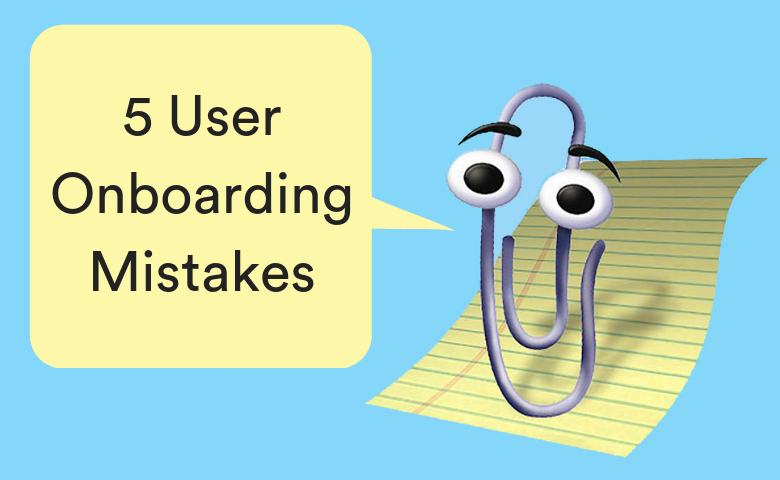
Almost as fatal a mistake as not providing enough support to new users is providing way too much. Everyone has experienced an over-onboarding nightmare - unskippable tours, six tooltips on one screen, or a tutorial about features we're not interested in. It can even be something as simple as explaining features that should be obvious - you probably don't need to tell your users that the big red button that says "SAVE" lets them save their work.
This is a trap that's very easy to fall into - particularly if you have previously struggled with Blank Screen Syndrome. The problem is that this robs your users of any autonomy in exploring your software. Overly long tours and tutorials force them to wait before they can actually start using your software, and too many tooltips distract from the interface that you've worked so hard on. The key is to find the middle ground. Focus on keeping your onboarding integrated, not distracting, and making sure it guides users towards success without being overly prescriptive.
Overpromising
If you're going to make promises to potential users to convince them to start using your software, you'd better make sure you can deliver on them. Saying that your software can solve a certain problem when it can't is a very quick way to chase away new users who wanted to solve that problem. Similarly, telling people that your signup process will take 2 minutes, when it's really more like 10, increases the chance of your users becoming frustrated and giving up. It's all about managing expectations. Being honest with your users about your signup process and the capabilities of your software will lead to a better experience for them and a higher retention rate for you.
Not measuring your onboarding properly
It's crucial to measure your onboarding in a way that lets you see whether or not it's working. After all, how will you improve your onboarding process if you don't know what the pain points are? You can do this by tracking user actions within the software, monitoring your support channels for common issues, or surveying your users specifically about the onboarding process. A combination of these approaches should give you a good idea of how you can make your onboarding better.
Abandoning users after they've "completed" onboarding
Congratulations, your user has achieved their first small success! This is where your job ends, right? That user may have technically completed their onboarding process, but staying in communication with them will help them on their journey to becoming a power user. Keeping in touch via email is a great way to stay in their mind and encourage them to discover new problems they can solve with your product. Letting users know where they can find any in-app tutorials is also a great way to avoid leaving them stranded. This lets them go back later and remind themselves of anything they've forgotten, and independently develop their skills.


