
How To Build Labeled Scatter Plots and Bubble Charts in R | Step-by-Step Guide
This post explores how the R package for labeled scatterplots tries to solve the problem of scatterplots and bubble plots or bubble charts in R. The rhtmlLabeledScatter R package on GitHub that attempts to solve three challenges with labeled scatter plots or bubble charts in R: readability with large numbers of labels and bubbles, and the use […]
What is a Labeled Scatter Plot? Simple Explainer

A labeled scatter plot is a data visualization that displays the values of two different variables as points. The data for each point is represented by its horizontal (x) and vertical (y) position on the visualization. A text label is used to show the meaning of each data point. Don’t forget you can create a […]
Using Scatterplots to Chart Trends in Displayr
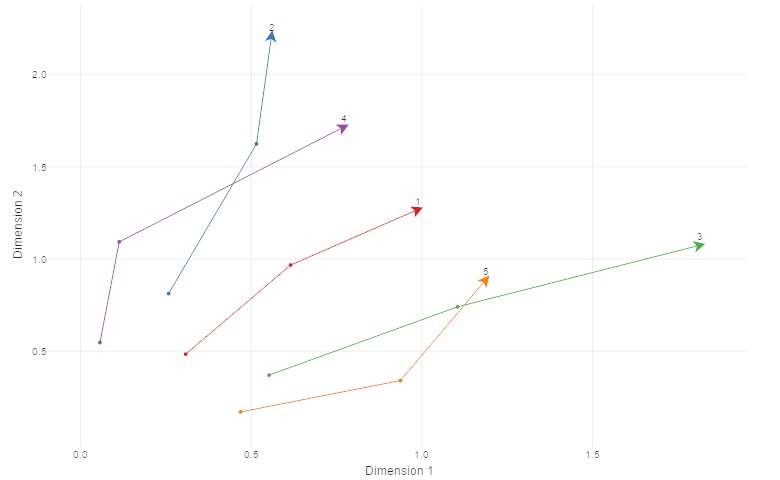
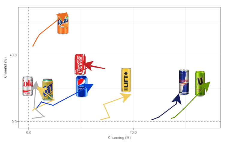
A scatterplot is a great way to visualize two variables from a data set. In this post, I describe how to extend a basic scatterplot to show trends. The trends reveal how the data evolve through time. Don’t forget you can create a scatterplot for free using Displayr’s scatterplot maker! Showing movement through time The chart […]
Adding Logos to Scatter Plots in Displayr
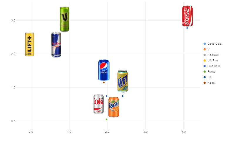
Adding labels to a scatter plot is a great way to increase understanding. By using logos we can take that process a step further. Users are immediately aware what each point represents. In this post I explain how to add logos to a scatter plot in Displayr. Don’t forget you can create a scatterplot for […]
What is a Scatter Plot? Visualize Correlation With Ease
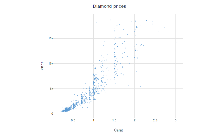
A scatter plot is a data visualization that displays the values of two different variables as points. The data for each point is represented by its horizontal (x) and vertical (y) position on the visualization. Additional variables can be encoded by labels, markers, color, transparency, size (bubbles), and creating ‘small multiples’ of scatter plots. Scatter […]