
Customizing Colors Within a Series on a Bar, Column, or Pyramid Visualization

In Displayr, you can customize the colors within a series for bar charts, column charts, and pyramids created using Insert > Visualization. This can make visualizations more informative and engaging. The normal boring use of color The bar chart below is the default bar chart created by Displayr. Color is merely adornment on this chart; […]
How to Create a Pyramid Chart in Displayr
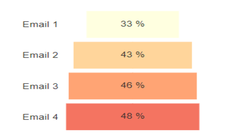
Pyramid charts, sometimes referred to as funnel charts or “wedding cakes”, are a popular option for visualizing results from funnels (like different types of brand or website conversion funnels). They are like a bar chart, except that the bars are symmetrical about the center of the chart. Data for such charts usually has a natural […]