
Column Chart.
A column chart is a data visualization where categories are represented by rectangles. The height of the rectangle is proportional to the values. Read more.
Continue reading
Find out how to use column charts for categorical data representation and enhance your data visualization skills in Displayr.
Continue reading

By adding a line to a column chart, you can add context to make your visualization more compelling and better display the relationship between two…
Continue reading

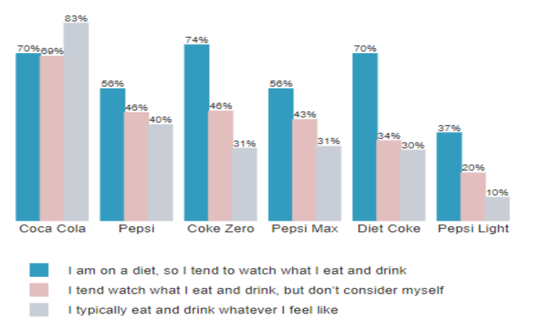
The normal boring use of color The bar chart below is the default bar chart created by Displayr. Color is merely adornment on this chart;…
Continue reading
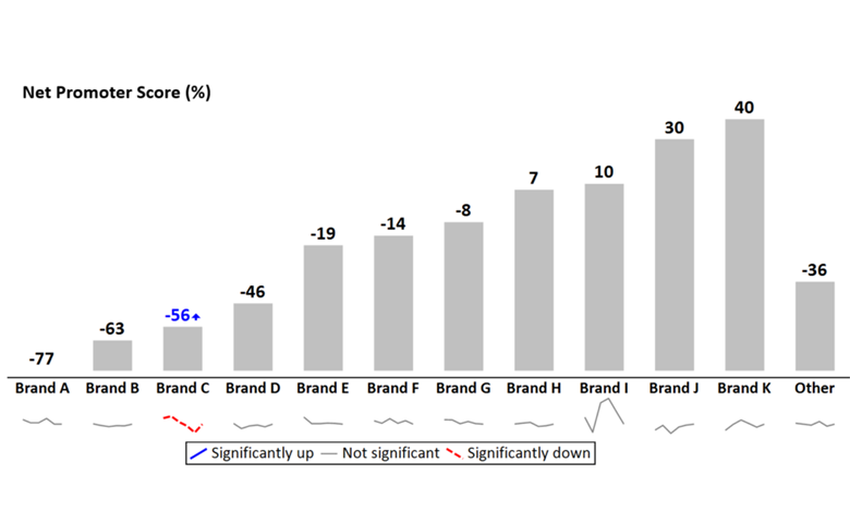
Using sparklines in charts with multiple series of data improves readability by showing where are we today, movement since last time and long-term trend.
Continue reading