This discussion of the relative pros and cons of tidy data and numerate data was inspired by a mini-argument I had with a colleague about the use of R data frames in our charting package. Many data scientists of all levels automatically default to the tidy data format. But why? In this post, I suggest why you may want to consider an alternative - numerate data.
What is tidy data?
Tidy data refers to a table of data where each row represents an observation, each column represents a variable, and the table contains only a single type of observational unit. Many data scientists swear by tidy data as the standardized format for cleaning data and setting up the data analysis process.
The basic idea of tidy data has been around at least since 1968. Why 1968? This is when SPSS launched. While tidy data may seem revolutionary to some R users, it is a central part of SPSS. As SPSS is structured around the use of tidy data, it is virtually impossible do anything without it. SAS also relies heavily on tidy data, as does Stata and just about all the main stats packages. Most machine learning software also assumes the basic structure of tidy data.

Image credit: R for Data Science (Hadley Wickham and Garrett Grolemund)
What's the problem with tidy data?
I am not against tidy data, nor the much-esteemed and ultra-productive Hadley Wickham. I appreciate the tidy data format and like most data scientists, find Hadley's tools for converting other formats into tidy data quite useful. As he explains, "Tidy data makes it easy for an analyst or a computer to extract needed variables because it provides a standard way of structuring a dataset."
I think we all know that structuring data in this format can be useful. My issue is with people's immediate assumption that data must be converted to this format. In the hands of the R Community, this droll remark by Hadley, "Messy data is any other arrangement of data" becomes a phrase of canonical importance. Many data scientists have taken this remark as less of a casual quip and more of an indictment against other data formats.
For example, the opening two sentences on the Wikipedia page on Tidy Data summarize it as:
"Tidy data is the data obtained as a result of a process called data tidying. It is one of the important cleaning processes during big data processing and is a recognized step in the practice of data science. Tidy data sets have structure and working with them is easy; they’re easy to manipulate, model and visualize."
The big problem with this definition is the last word: visualize. Tidy data is extremely difficult to visualize. More traditional table formats are often superior.
An alternative to tidy data: numerate data
What is numerate data? Numerate data is data in a format where its key properties can be easily identified by the viewer by visual inspection. This idea is best stated by Andrew Ehrenberg in his great The American Statistician paper from way back in 1981:
People often feel inept when faced with numerical data. Many of us think that we lack numeracy, the ability to cope with numbers. The message of this article is that we are not to blame: The fault is not in ourselves, but in our data. Most data are badly presented and so the cure lies with the producers of the data.
To draw an analogy with literacy, we do not need to learn to read better, but writers need to be taught to write better. Luckily, numerical data have inherent structure. This makes numbers easier to communicate than ideas or verbal arguments.
Numerate data versus tidy data
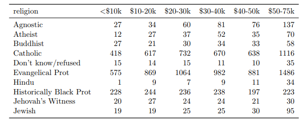
Let's kick off this comparison by seeing what is lost and gained in each data format. In this Tidy Data paper, Hadley illustrates how to turn the following 'Messy Data' into Tidy Data:
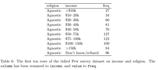
He then shows how his nifty functions can be used to restructure the data to make it 'tidy'. Sadly, tidy in this case also means voluminous, so he only shows a tiny snippet of the data:
So what have we lost in the transition to tidy data? Well as it turns out, we've lost quite a lot. The original 'messy' data version shows data that disappears in the tidy data format:
- We are missing the right-hand side of the data (i.e., people with incomes of over $75K). This initially seems like a drawback for the 'messy' data format but this format actually makes the problem easy to spot. On the other hand, since tidy data can only be viewed in snippets, it becomes much harder to spot a problem like missing data.
- Similarly, we are missing all the religions that fall alphabetically after Jewish. This would be really difficult to spot if looking at the tidy data.
- The original table also allows us to quickly draw conclusions about the distribution of the data. The biggest of the shown religions is Evangelical Protestant. The $50-75K is the biggest of the income groups.
Now, let us take a look at the numerate data version. As a part of the process, I have converted the data to percentages (keeping in mind that the original data was not complete, so the percentages suffer from a sample selection bias).
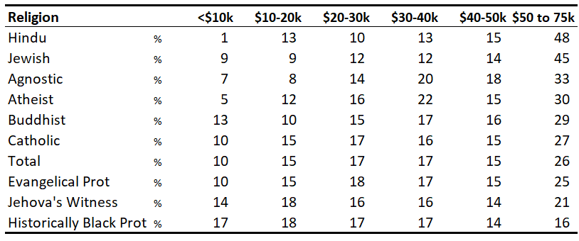
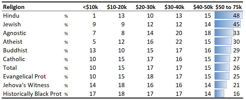
We can improve on this further with a bit of conditional formatting. This really brings to light the most striking aspect of the data - the massive difference between the religions in terms of higher incomes.
Where numerate data trumps tidy data
There are three situations where tidy data is much more of an hindrance than a help and numerate data is the better choice.
1. When we want to look at the data table
Fundamentally, tidy data does not help us if we want to look at the data. As a general rule, you should always present data in the numerate format where possible.
2. When we need to conduct statistical analyses that assume numerate data
Tidy data's core strength is when preparing data for use with techniques and software that assumes the data is in a tidy format. However, there are some techniques that are actually designed for numerate data formats - correspondence analysis, log-linear modeling, and statistical tests involving count data. Ironically, having your data in a tidy format when you need to perform these analyses tends to slow you down, as you typically will need to 'mess' it up again.
3. When quickly creating visualizations of aggregated data
ggplot, plotly, and the various plotting functions that use tidy data are at their best when two things coincide:
- You are interested in raw data instead of aggregated data.
- You do not have to create a lot of charts in a short amount of time.
If you're like me, you need to create visualization quickly and generally with aggregated data (e.g., survey responses, sales data). Thus, visualization functions that assume tidy data tend not to be helpful.
The irony of tidy data and R
The irony for me and I suspect for many others of my vintage, is that R (and before that S) freed us up to analyze data that was not 'tidy'. In particular, its great strength has always been that you can take the output of any analysis and use it as an input for conducting other analyses. By contrast, because SPSS assumes tidy data I used to waste countless hours reformatting numerate data as tidy data just to get it into SPSS. It exasperates me to see less experienced data scientists finding virtue in the ugliness of forcing numerate data into the tidy data format.
R and the real challenge of numerate data
However, while R is better in terms of being able to manipulate numerate data than other data science apps, the whole issue of numerate data highlights two of its key weaknesses.
The first weakness involves R's tabular data outputs. It isn't coincidental that Hadley has formatted his examples in LaTeX. R users who care about the formatting of tables often have to leave R to create numerate data with LaTeX, the HTMLwidget ecosystems, or Excel. Perhaps that's why R users are so attached to the idea of tidy data - most of the tabular presentations aren't intuitive enough to support interpretation anyway.
The second weakness is that popular R plotting packages expect data to be in a tidy data format. This leads to one of the amusing ironies of the world of data science consulting. Among the consultants who have the job of interpreting data, rather than those at the engineering end of the data science chain, good old Excel and PowerPoint remain the dominant tools. It is not because people in these fields, such as market research and management consulting, are slow to adapt. Some even use R to crunch the numbers. But, if you need to quickly create professional presentations, you get a lot more done in Excel and PowerPoint than in R.
I'll leave you with some food for thought. Most good analysis starts with getting data into a tidy data format. It is usually optimal for cleaning, for efficient variable transformations, and as an input into most advanced techniques. Most good analysis ends with numerate data.
To check out more about all things data science, head on over to our blog!
