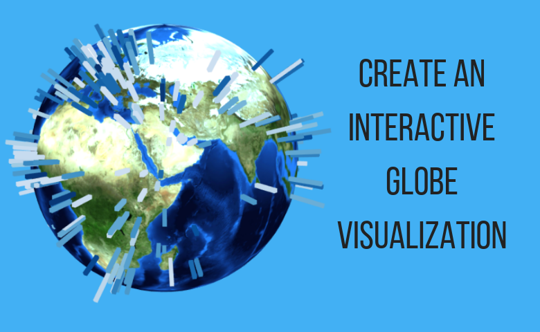
If you have geographic data, you can use a bit of R code to plot it on an interactive globe. This visualization is completely customizable and allows rotation and zoom.
In this earlier post we analysed the location of meteorite impacts from this dataset, including plotting their fall locations on a globe. In this latest post we are going to explain how to create the globe with code. We then go on to describe other options and variations on the same theme.
Check out this interactive globe visualization and try it yourself
Preparing the data
To import the data in to Displayr, click on the New Data Set button on the Home menu, then click URL and paste in this link: https://data.nasa.gov/api/views/gh4g-9sfh/rows.csv?accessType=DOWNLOAD. We then right click on the data under Data Sets on the left to rename the data Meteorites.
Next, we are going to convert the year (which is imported as text string of date and time) into an age in years. Click on Insert > New R > Numeric Variable and paste in the following code.
current <- as.numeric(format(Sys.Date(), "%Y"))
age <- current - as.numeric(substr(Meteorites$Questions$year, 7, 10))
Plotting the data
Now we’ll make the map. On the Insert tab, insert an R Output and paste in the following code (which we explain below).
library(threejs)
library(flipChartBasics)

# Make a data.frame of the required information
x <- data.frame(long = Meteorites$Questions$reclong,
               lat = Meteorites$Questions$reclat,
               mass = Meteorites$Questions$`mass (g)`,
               age = age)

# Set colors on a scale of 1 to 10 by percentile
colors <- as.numeric(cut(x$age,
                         breaks = quantile(x$age,
                                           probs = seq(0, 1, 0.1),
                                           include.lowest = TRUE,
                                           na.rm = TRUE)))
palette <- ChartColors(10, "Reds", reverse = TRUE)
colors <- palette[colors]

# Plot the data on the globe
globejs(lat = x$lat,
        long = x$long,
        val = 2 * log(x$mass),
        color = colors,
        pointsize = 0.5,
        atmosphere = TRUE)
Stepping through the code, we first import required libraries then create a data frame with the variables that we need. We then convert age into a number from 1 to 10 (a.k.a its decile), then map those numbers to shades of red. Finally we plot the data on the globe where val determines the length of each line and point size determines the line thickness.
The output is slightly different from the original in the meteorites post because we have not excluded any data. You can spin the globe around with your mouse and zoom in or out.
Check out this interactive globe visualization and try it yourself
Capital cities
As a second example, we’ll plot capital city data available here. Import the data using New Data Set as for previous example except with this URL: https://esa.un.org/unpd/wup/cd-rom/WUP2014_XLS_CD_FILES/WUP2014-F13-Capital_Cities.xls. You can ignore the warning about multiple sheets. Rename the imported data set CapitalCities.
The Population (thousands) variable is imported as text (which you can tell by the letter “a” before the variable name). To convert it to a number, click on it then under Properties on the right of the screen change Structure to Numeric. This creates a new numeric variable in the Data Set called Population (thousands)1.
The code to make the globe is broadly similar to that above. Enter the following code in the Object Inspector on the right after selecting Insert > R Output.
library(threejs)
library(flipChartBasics)

# Make a data.frame of the required information
x <- data.frame(long = Longitude,
                lat = Latitude,
                population = `Population (thousands)1`,
                city = `Capital City`)

# Set colors according to first letter of city name
first.letters <- sapply(substring(x$city, 1, 1),
                        utf8ToInt) - utf8ToInt("A") + 1
palette <- ChartColors(26, "Blues")
colors <- palette[first.letters]

# Plot the data on the globe
earth <- "http://eoimages.gsfc.nasa.gov/images/imagerecords/73000/73909/world.topo.bathy.200412.3x5400x2700.jpg"
globejs(img = earth,
        lat = x$lat,
        long = x$long,
        val = 10 * log(x$population),
        color = colors,
        pointsize = 5,
        atmosphere = FALSE,
        bg = "white")
Check out this interactive globe visualization and try it yourself
A few notable differences are:
- Addition of a more colorful background world image via the img argument.
- Line lengths related to population with colors according to the first letter of the city name (light blue = A, dark = Z).
- Removal of atmosphere, increase of point size and amending the default background (bg) color.
Finally, the globe image can be changed. If you wanted to confuse people by presenting the same information with an arbitrary citrus theme, you could make the following:
Conclusion
The globes are created with the threejs package. You can follow see and modify the examples in this post by following this link.
Check out this interactive globe visualization and try it yourself


