
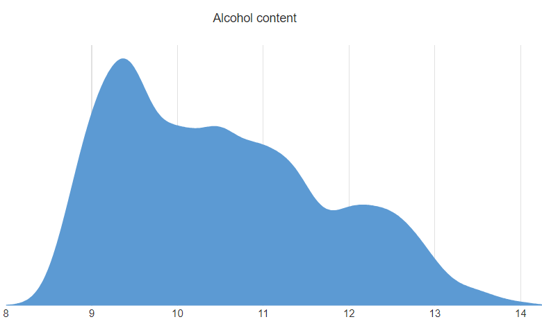
Density plots can be a great tool for trying to understand the shape of the distribution of some data. They do not plot the data directly, but instead use an algorithm to first estimate the shape of the distribution before drawing it. In this post I show you how you can create a density plot in Displayr.
You can use Displayr's density plot maker to create your own density plot for free.
Raw data
We typically use density plots to visualize the distribution of some raw data. By raw data I am referring to values which represent observations of a particular quantity. It could be number of hours spent on social media, average price of avocados each day for a year, number of visits to a website each hour, and so on. You need to have enough observations for it to be meaningful to estimate a distribution from the data. You should avoid figures that are aggregated and form a small set. This means that data you would typically show in a pie, bar, or column chart, are out.
In my first example, I have a column of data that I have sourced from Twitter. The rows of the data represent individual tweets, and the numbers tell us how many times each Tweet was retweeted by other users. This comes from part of the Trumps Tweets data set that I have covered in previous posts. The data looks like this:
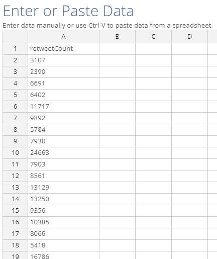
In Displayr there are many paths to getting raw data and in this post I'll cover two of the most common cases. In the first case, you have collected some raw data and you just want to paste it in a make the visualization. With the second case, you have a data set containing some raw data that you can load into Displayr for analysis.
Method 1 - Pasting in data
The easiest way to create a visualization in Displayr is to paste your data in. For a density plot:
- Select Insert > Visualization > Density Plot.
- Click the Paste or type data button, which you will find in the Inputs > DATA SOURCE section of the Object Inspector on the right side of the screen.
- Paste your data into the spreadsheet interface (it should look like my screenshot above) and click OK.
- Tick the Automatic box in the top right.
- Change settings related to the density plot and its appearance in Chart section.
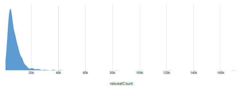
The density plot for the retweet counts reveals a large mass of tweets having between zero and twenty thousand retweets. Then, a much smaller bunch of tweets reach towards forty thousand. Finally, there are a small number of tweets with extremely high (relatively speaking) numbers of retweets. These are the barely-visible bumps at around 80k, 120k, and 170k retweets.
Method 2 - Data from a data set
Often a density plot will be part of a larger exploration and analysis of a data set involving multiple variables. This is where Displayr's statistical features shine. You can add data from a range of different sources, including uploading a variety of file types (SPSS, Excel, CSV), by connecting to a SQL data base, or by bringing in data from a URL. All of these are available by clicking Home > New Data Set. For more about the different data sets you can add, see our other post Getting Your Data into Displayr. Once you have added your data set, the variables will become available in the Data Sets section in the bottom left.
In this example I have added a data set which contains information about the properties of 5000 Portuguese wines. This data set is originally from here, and we have discussed it previously here.
The variable(s) for the density plot should be numeric. To check this, locate the variable(s) in the list under Data Sets, and look at the icon next to the variable. In this case I have set the variables up to look like this:
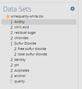
Displayr has set up most of the variables as numeric. This is indicated by the little number '2' icons next to them. Some, like Sulfur Dioxide, are variable sets which consist of two or more variables grouped together. This is indicated by the icon with two 2's.
To create a density plot which shows the distribution of alcohol content, I:
- Select Insert > Visualization > Density Plot.
- Click into Inputs > DATA SOURCE > Variables in 'Data' in the Object Inspector on the right, and choose the alcohol variable.
- Tick the Automatic box in the top right.
The density of alcohol content shows the peak of the alcohol distribution at around 9%, but with a large number reaching much higher alcohol content, with some as high as 14%.
Grouping densities
When you use method 2 and supply a variable to the density plot, you can also choose to supply an additional variable for creating groups. This allows you to draw the density for each group on the same set of axes. To do so, choose a second variable in Inputs > DATA SOURCE > Groups. In this case, I choose the Quality variable. The quality gives a rating of each wine's quality, and I have grouped these into three rough groups based on the distribution.
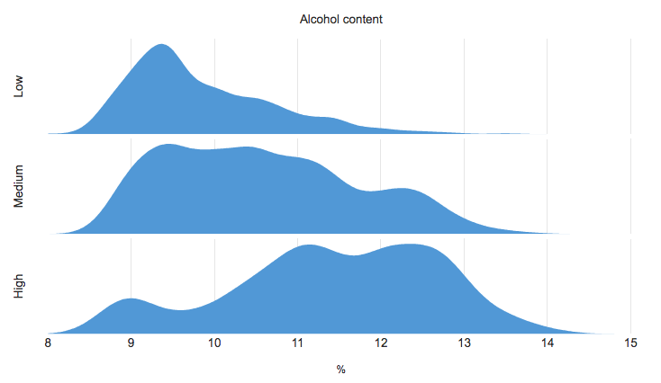
The main noticeable feature is that the wines with low quality rating tend to have lower alcohol content, while most of the wines with higher quality have 11% alcohol content or more.
Discover more ways to visualize your data with Displayr.
