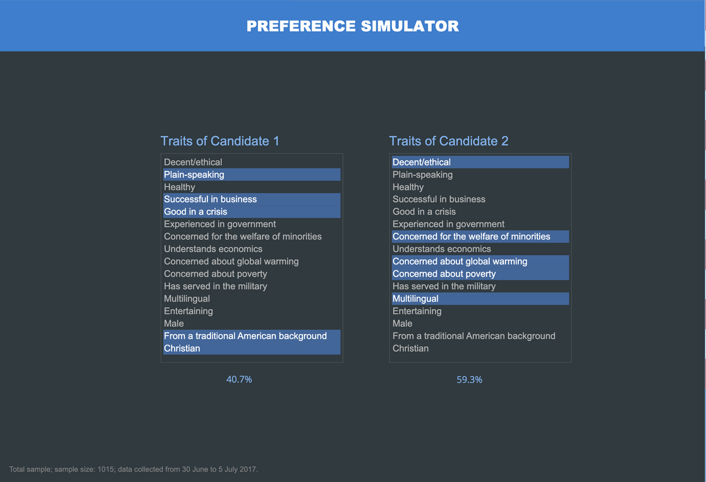
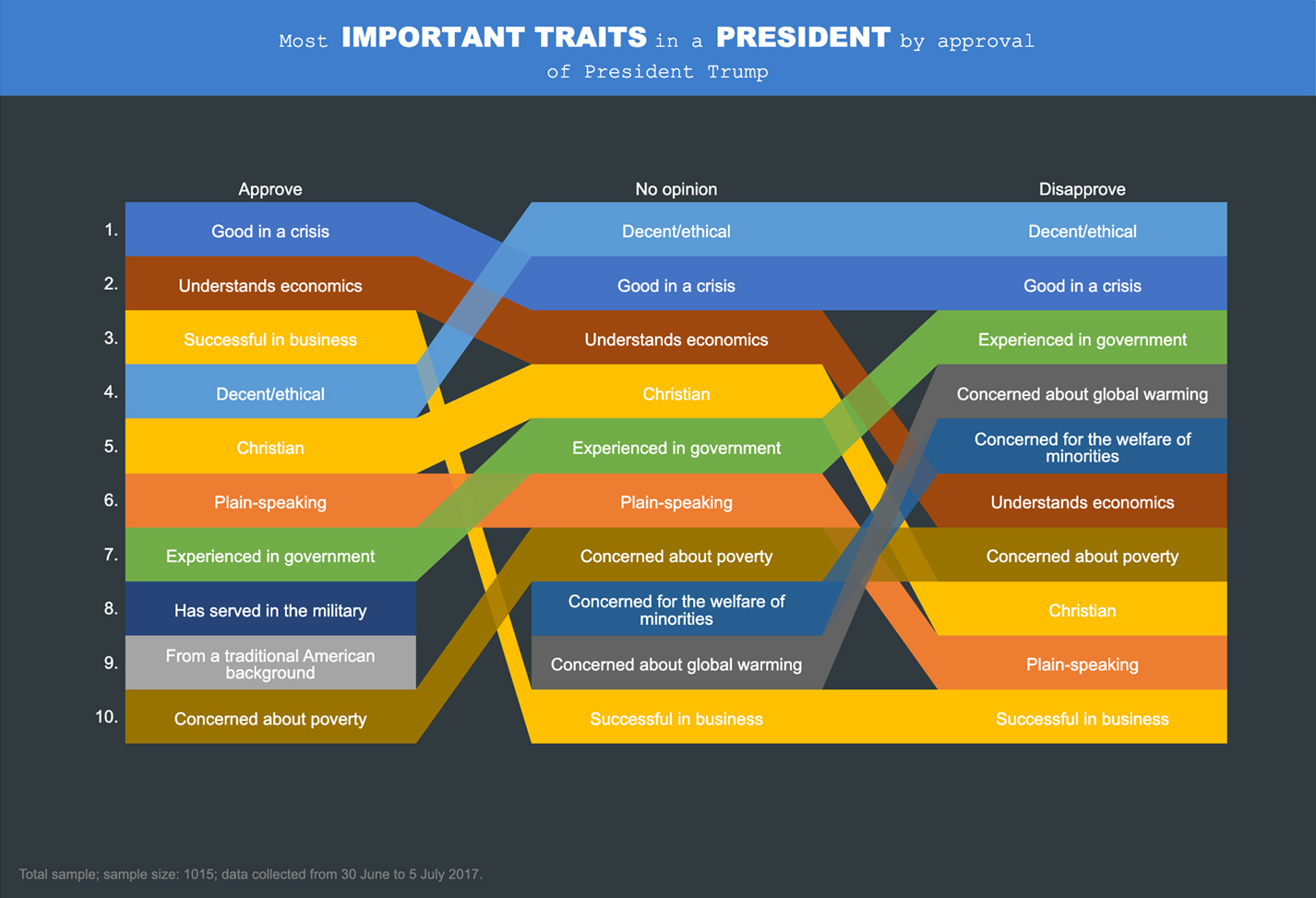
Commander-in-Chief MaxDiff
An alternative to PowerPoint, story-style dashboard showing an analysis of what Americans desire in their Commander-in-Chief. The visualizations, text summaries, and the underlying analysis (a MaxDiff model) all automatically update when a filter is applied, or when a revised data file is imported (i.e., it is an automated report).
TRUSTED BY THOUSANDS OF CUSTOMERS

Displayr is at least 50% faster than just creating a PowerPoint presentation. In some cases, I think it’s even higher than 50%.

Matt Hubbard
VP Data & Analytics, Cygnal
More examples
Customer Feedback Dashboard
Interactive | Multi-Page
Exploring US Diet Trends
Interactive | Multi-Page
Financial Segmentation Dashboard
Interactive | Multi-Page
Decision Support Dashboard
Interactive | Multi-Page


