Correspondence Analysis.
This is the ultimate guide for correspondence analysis, visualization, and interpretation. Everything you need to know is here: from basic how tos to tips and tricks that will aid in interpretation to advanced concepts. Worked examples are shown in Displayr, R and Q.
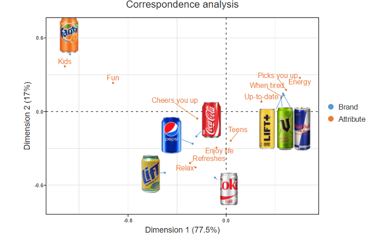
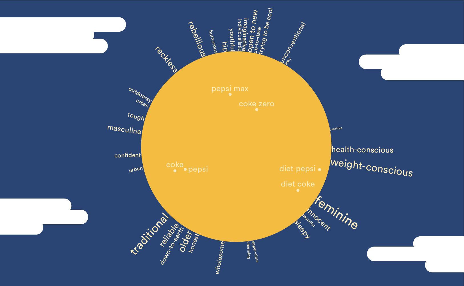
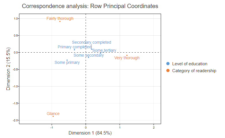
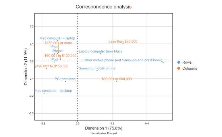
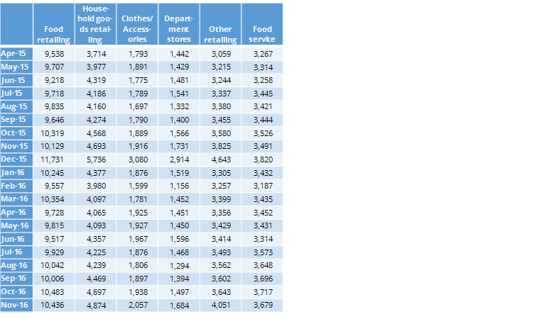
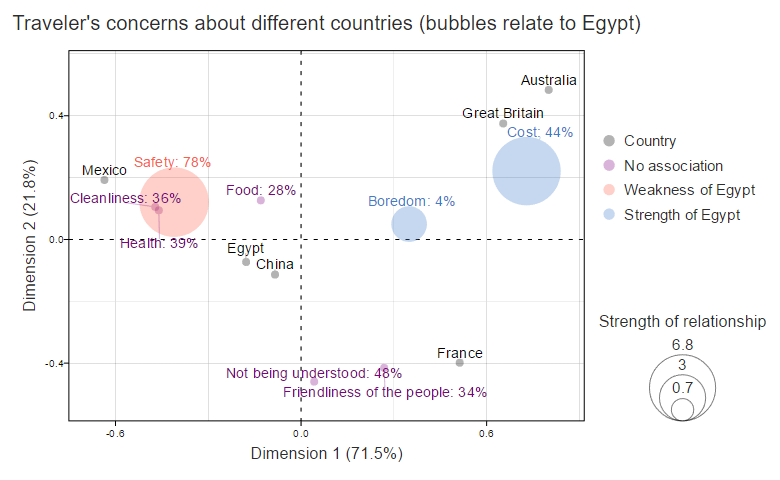
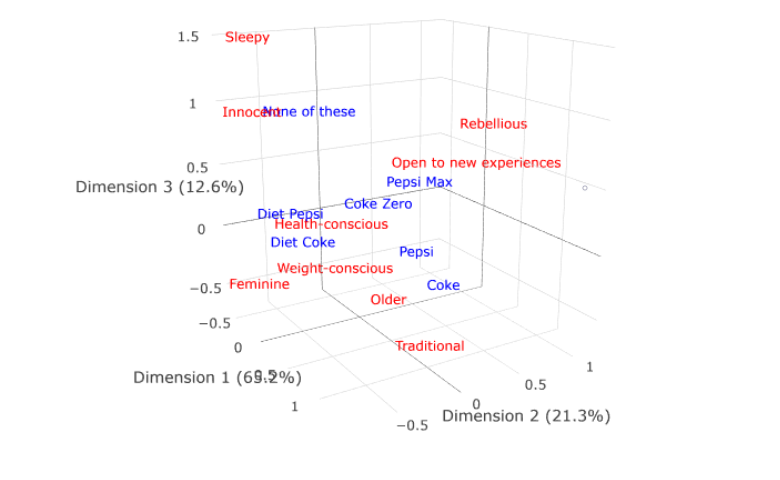
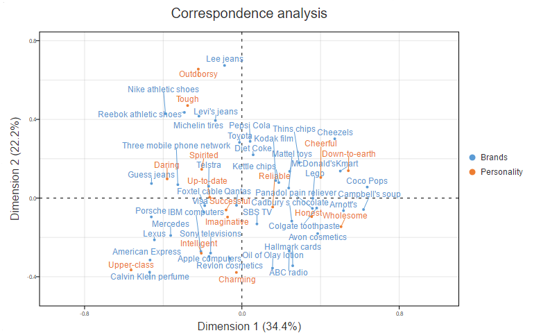
Correspondence analysis is a popular data science technique. It turns large tables of data into relatively easy to read visualizations. Which makes it easier to find key insights in the data. Correspondence analysis is also commonly used by market researchers to create brand switching and positioning maps. Scatter plots are the most common way to visualize results. However, moon plots have the same conclusions, are often even easier to interpret.
