


Creating a pie chart is extremely easy using Microsoft Excel. In this article, we’ll look at how to create a basic pie using Excel.
Pie charts 101
Pie charts are among the most common data visualization charts. Put simply; pie charts show how different portions combine to form a whole. This makes them ideal for scenarios where you need to show time allocation, revenue breakdowns, tracking expenses, or demographic breakdown.
That being said, if a pie has too many ‘slices,’ it can be difficult to comprehend. For this reason, it is recommended that pie charts show around eight different categories as a maximum. It is also essential that the different categories all add up to 100%.
Pie charts in Excel: Everything you need to know
When it comes to creating a pie chart in Excel, it is important to first decide exactly what you want your visualization to show. This is because there are a range of different pie chart options in Excel for you to choose from, including;
- 2-D Pie Chart: A standard, flat pie chart
- 3-D Pie Chart: A standard pie chart that is three-dimensional
- Pie of Pie: Allows the reader to break smaller slices into another pie
- Bar of Pie: Similar to Pie of Pie but with a bar chart
- Doughnut Chart: Similar to a 2-D Pie Chart but with a blank center, like a doughnut
Getting your data ready for your pie chart
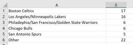
The most common approach for creating a a pie chart in Excel is to first setup your data in a basic table. Make sure that your first column contains the labels and your second, the values. For this example, we’re going to create a pie chart based on the number of NBA Championships won by each team. Since there are 30 teams in the NBA, we’ll focus on those that have won a minimum of 5 championships and group the others into an “Other” category. Here is what our data looks like:
Creating your pie chart
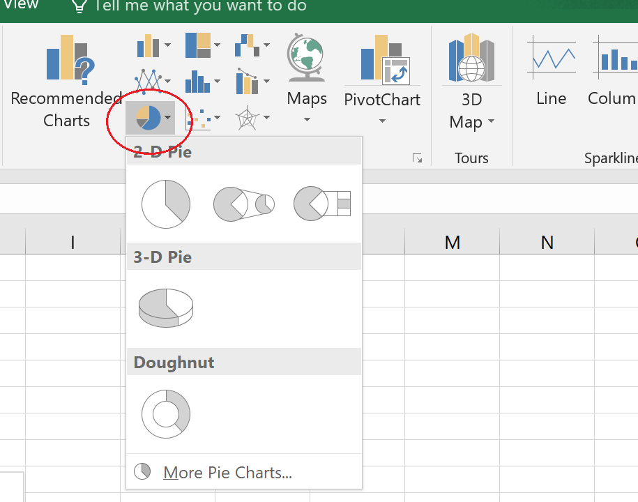
To create a chart from the data, highlight the data range (cells A1:B6 in this case) and select Insert > Charts (group) and select the Pie Chart option. For this example I’ve selected the 3-D Pie option on the second row.
A pie chart object is created on the sheet. Modify the pie chart properties by first selecting the pie chart and then going to the Chart option that appears at the top of the menu tool bar. From here you can modify the design and format properties of the chart. I’ve modified the chart title, color scheme and chart style below.

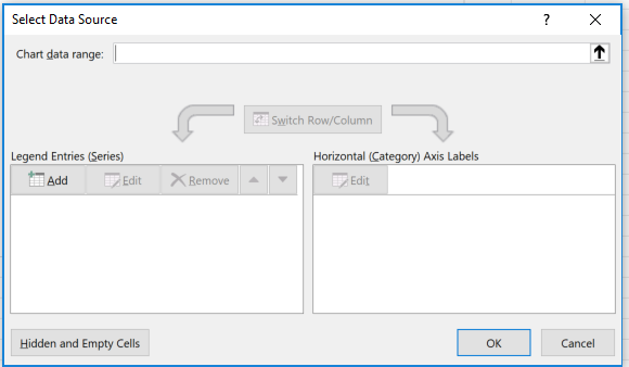
In the example above, we started with the data and turned this into our chart. In Excel, you also have an option to create the chart object first and then provide the data to populate the chart. To do this, first select the pie chart from the Insert > Charts menu to select one of the pie chart options. This will create an empty pie chart object on the sheet. Next, select Chart Tools > Design > Select Data (Data group). This opens the Select Data Source dialogue box. Note that the chart object must be selected for the Chart Tools menu to appear.
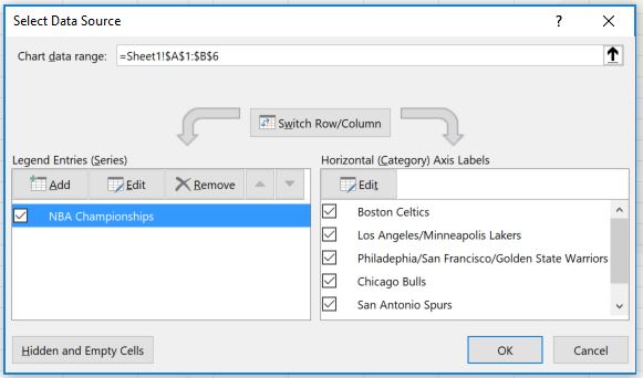
Under Legend Entries (Series) click Add. Then for Series values, select the values in cells B1:B6 and click OK. You can leave the Series name field blank. But whatever is entered here will be used to populate the chart title. Next, in the Horizontal (Category) Axis Labels section, click the Edit button and for Axis label range select the values in cells A1:A6. and click OK. Excel generates the same chart as above. Again, you can modify the chart design and formatting using the Chart Tools menu as described above.
Ready to move beyond Excel? There are other ways to create visualizations that offer more advanced options and flexibility. Check out “How to create a bar chart in Displayr“.
