
What’s in a Name? A Data Science Analysis of Smartphone Marketing
Are you the kind of person who would queue outside an Apple store overnight to be the first to score the latest iPhone? Or maybe you're a Samsung fan, confident that your brand reigns supreme. Perhaps you've jumped on the Pixel train, the flagship smartphone of tech giant Google. There's no doubt that many of us rave about the amazing features of our phones. But what do the brands say about their own products? It's more revealing than you think.
Marketing is crucial for a tech company. It's essential to convincingly and memorably illustrate why a consumer should buy your phone, as opposed to any of the other hundreds of models they could opt for. The language used by brands to describe and market their latest products can provide many interesting insights about how these products are marketed, and why companies choose to market these phones in this way.
The data behind smartphone marketing
Luckily, we can use data science to help us illustrate the differences between different brands! The table below contains every sentence on the "overview" or "highlights" page for Apple's iPhone X, Samsung's Galaxy S9/S9+, and Google's Pixel. This includes reviews which have been quoted on the page, but does not include headings, footnotes, or annotations.
Straight away we can see that the iPhone X page contains more sentences than either the Galaxy or the Pixel (scroll to the last page and you'll see that it only contains sentences from the Apple website). A table like this can be useful to compare how these phones are described. But it's messy. A clearer way visualize this data is with a series of word clouds that will highlight the words most frequently used.
Apple iPhone X word cloud
Samsung Galaxy S9 word cloud
Google Pixel word cloud
This gives us an immediate picture of some of the key differences in the language used to market these different phones. As you'd expect, some types of words are common to all three smartphones. This includes words related to the physical characteristics of any smartphone - like the screen, the camera, or the battery. It also includes words like "impressive", "revolutionary", and "beautiful", which all have an emotive value and serve to convince the reader of the value of that particular model. But just looking at these visualizations, we see differences. The Galaxy word cloud looks like it contains a lot of words relating to cameras and photography. By contrast, both the iPhone and Pixel word clouds look more varied. Let's see if some other visualizations will highlight these differences for us.
Comparing and contrasting
By looking at how frequently different words are used, we begin to see what the marketing teams at these companies think is the key selling feature of their smartphone. One of the most interesting features of these word clouds is the varied prominence of the product's name. In the Apple and Google clouds, "iPhone" and "Pixel" are among the largest words displayed. But in the Samsung cloud, "Galaxy" is small and hidden. If we graph the number of times the product name appears on the site, we get this:
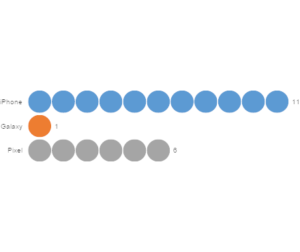 The word "Galaxy" only appears once on the "Highlights" page designed to convince people to buy a Galaxy! There are 492 total words in the dataset, meaning the density of the product name is only o.2%. By contrast, the density of the word "iPhone" in the Apple dataset is 1.7%. Looking at the word cloud for the Galaxy, the word that jumps out at you is "camera". If we plot the frequency of the word "camera" or "cameras" across all smartphones, we get this:
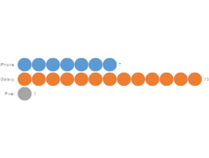 The word "camera" appears 13 times on the Galaxy page! This equals a density of 2.6% - significantly higher than the density of the word "iPhone" on the iPhone X page. From this alone, we get an idea of the marketing angle of Samsung compared to either Apple or Google.
Another interesting metric is the number of times the brand - Apple, Samsung or Google - is referred to on the smartphone's page.
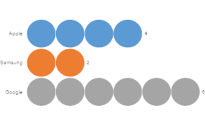 This one's closer, but still interesting. Samsung is referred to only half as many times as Apple, and only a third as many times as Google. It's particularly notable that the Pixel page, the shortest at only 239 words, mentions Google 6 times - a density of 2.5%!
What does this mean?
What does all this tell us about how these smartphones are marketed? The Pixel's page mentions Google extremely frequently - by density, five times more often than the Galaxy's page mentions Samsung. I suggest that this is because Google is a far more universal brand than Samsung, and thus lends more credibility. Especially as the Pixel is a relatively newer entry into the market, it makes sense to leverage the brand name of Google.
By contrast, the word most frequently used on the Galaxy page is "camera". Clearly, Samsung relies heavily on the phone's camera as a selling point - more so than is true for either the iPhone X or the Pixel 2. I think this is because Samsung can't rely on its own brand name to promote the product as much as either Apple or Google can, so it has to refer to a physical feature of the phone that makes it stand out.
However, I asked around the office, and there were some other interesting theories. One is that it's because Samsung is associated with the catastrophe of the exploding Galaxy Note 7s from 2016, so they don't want to remind people of that by using their brand name too much. Another is that Samsung, as an Asian company, perceives that Western people will trust it less than they would trust American tech companies. Whatever the reason, it clearly has a big impact on Samsung's marketing strategy.
And as for Apple? "iPhone" is the word most frequently used on the iPhone X's page. I think this is for the same reason that Google is so frequently mentioned on the Pixel's page. Except in the case of Apple, the iPhone name itself has become so ubiquitous that it's unnecessary to refer back to Apple to build credibility. The iPhone X already has brand credibility purely because it's an iPhone.
So there you have it! Do you think I'm right about smartphone marketing? Let us know!
See how we did this analysis in Displayr, or check out more of our Data Stories!


