
Create and Update PowerPoint Reports Using R

In my sordid past, I was a data science consultant. One thing about data science that they don't teach you at school is that senior managers in most large companies require reports to be in PowerPoint. Yet, I like to do my more complex data science in R - PowerPoint and R are not natural allies. As a result, creating and updating PowerPoint reports using R can be painful.
In this post, I discuss how to make R and PowerPoint work efficiently together. The underlying assumption is that R is your computational engine and that you are trying to get outputs into PowerPoint. I compare and contrast three tools for creating and updating PowerPoint reports using R: free ReporteRs package with two commercial products, Displayr and Q.
Update: Some extra approaches have been pointed out by kind readers, so please read the comments to this post as well.
Option 1: ReporteRs
The first approach to getting R and PowerPoint to work together is to use David Gohel's ReporteRs. To my mind, this is the most "pure" of the approaches from an R perspective. If you are an experienced R user, this approach works in pretty much the way that you will expect it to work.
The code below creates 250 crosstabs, conducts significance tests, and, if the p-value is less than 0.05, presents a slide containing each. And, yes, I know this is p-hacking, but this post is about how to use PowerPoint and R, not how to do statistics...
library(devtools)
devtools::install_github('davidgohel/ReporteRsjars')
devtools::install_github('davidgohel/ReporteRs')
install.packages(c('haven', 'vcd', 'ggplot2', 'reshape2'))
library(ReporteRs)
library(haven)
library(vcd)
library(ggplot2)
library(reshape2)
dat = read_spss("http://wiki.q-researchsoftware.com/images/9/94/GSSforDIYsegmentation.sav")
filename = "c://delete//Significant crosstabs.pptx" # the document to produce
document = pptx(title = "My significant crosstabs!")
alpha = 0.05 # The level at which the statistical testing is to be done.
dependent.variable.names = c("wrkstat", "marital", "sibs", "age", "educ")
all.names = names(dat)[6:55] # The first 50 variables int the file.
counter = 0
for (nm in all.names)
    for (dp in dependent.variable.names)
    {
        if (nm != dp)
        {
            v1 = dat[[nm]]
            if (is.labelled(v1))
                v1 = as_factor(v1)
            v2 = dat[[dp]]
            l1 = attr(v1, "label")
            l2 = attr(v2, "label")
            if (is.labelled(v2))
                v2 = as_factor(v2)
            if (length(unique(v1)) <= 10 && length(unique(v2)) <= 10) # Only performing tests if 10 or fewer rows and columns.
            {
                x = xtabs(~v1 + v2)
                x = x[rowSums(x) > 0, colSums(x) > 0]
                ch = chisq.test(x)
                p = ch$p.value
                if (!is.na(p) && p <= alpha)
                {
                    counter = counter + 1
                    # Creating the outputs.
                    crosstab = prop.table(x, 2) * 100
                    melted = melt(crosstab)
                    melted$position = 100 - as.numeric(apply(crosstab, 2, cumsum) - 0.5 * crosstab)
                    p = ggplot(melted, aes(x = v2, y = value,fill = v1)) + geom_bar(stat='identity')
                    p = p + geom_text(data = melted, aes(x = v2, y = position, label = paste0(round(value, 0),"%")), size=4)
                    p = p + labs(x = l2, y = l1)
                    colnames(crosstab) = paste0(colnames(crosstab), "%")
                    #bar = ggplot() + geom_bar(aes(y = v1, x = v2), data = data.frame(v1, v2), stat="identity")
                    # Writing them to the PowerPoint document.
                    document = addSlide(document, slide.layout = "Title and Content" )
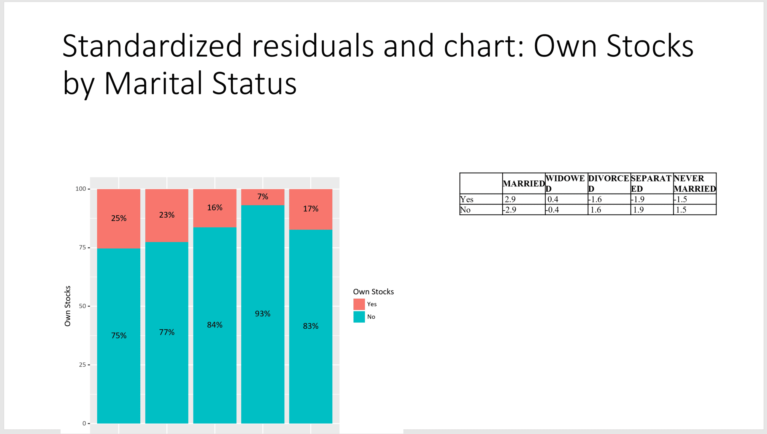
                    document = addTitle(document, paste0("Standardized residuals and chart: ", l1, " by ", l2))
                    document = addPlot(doc = document, fun = print, x = p, offx = 3, offy = 1, width = 6, height = 5 )
                    document = addFlexTable(doc = document, FlexTable(round(ch$stdres, 1), add.rownames = TRUE),offx = 8, offy = 2, width = 4.5, height = 3 )
                }
            }

       }
    }
writeDoc(document, file = filename )
cat(paste0(counter, " tables and charts exported to ", filename, "."))
Please see the technical notes below before running this example code.
Below we see one of the admittedly ugly slides created using this code. With more time and expertise, I am sure I could have done something prettier. A cool aspect of the ReporteRs package is that you can then edit the file in PowerPoint. You can then get R to update any charts and other outputs originally created in R.
Important Update: David Gohel has since rewritten ReporteRs. Gohel shared: "The new package is officer. FlexTable objects are now implemented in package flextable. Vector graphics are now implemented in package rvg and Native Microsoft charts can be produced with package mschart. Please use officer instead of ReporteRs. There are issues when using java > 1.8 that won’t be fixed."
Option 2: Displayr
A completely different approach is to author the report in Displayr, and then export the resulting report from Displayr to PowerPoint.
This has advantages and disadvantages relative to using ReporteRs. First, I will start with the big disadvantage, in the hope of persuading you of my objectivity (disclaimer: I have no objectivity, I work at Displayr).
Each page of a Displayr report is created interactively, using a mouse and clicking and dragging things. In my earlier example using ReporteRs, I only created pages where there was a statistically significant association. Currently, there is no way of doing such a thing in Displayr.
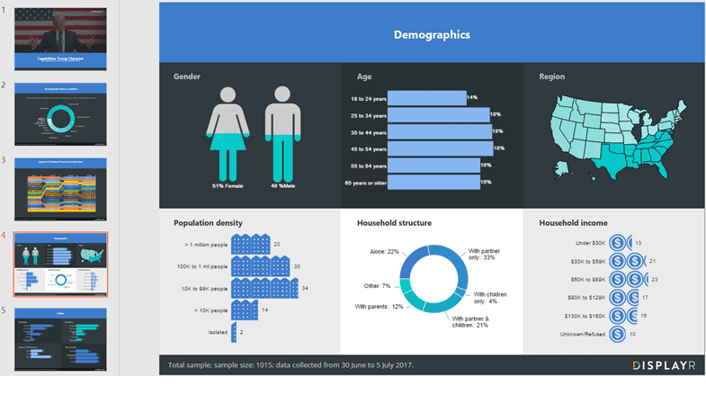
The flipside of using the graphical user interface like Displayr is that it is a lot easier to create attractive visualizations. As a result, the user has much greater control over the look and feel of the report. For example, the screenshot below shows a PowerPoint document created by Displayr. All but one of the charts has been created using R, and the first two are based on a moderately complicated statistical model (latent class rank-ordered logit model).
You can access the document used to create the PowerPoint report with R here (just sign in to Displayr first) - you can poke around and see how it all works.
A benefit of authoring a report using Displayr is that the user can access the report online, interact with it (e.g., filter the data), and then export precisely what they want. You can see this document as it is viewed by a user of the online report here.
Option 3: Q
A third approach for authoring and updating PowerPoint reports using R is to use Q, which is a Windows program designed for survey reporting (same disclaimer as with Displayr). It works by exporting and updating results to a PowerPoint document.
Q has two different mechanisms for exporting R analyses to PowerPoint. First, you can export R outputs, including HTMLwidgets, created in Q directly to PowerPoint as images. Second, you can create tables using R and then have these exported as native PowerPoint objects, such as Excel charts and PowerPoint tables.
In Q, a Report contains a series of analyses. Analyses can either be created using R, or, using Q's own internal calculation engine, which is designed for producing tables from survey data (i.e., crosstab software and advanced analytics).
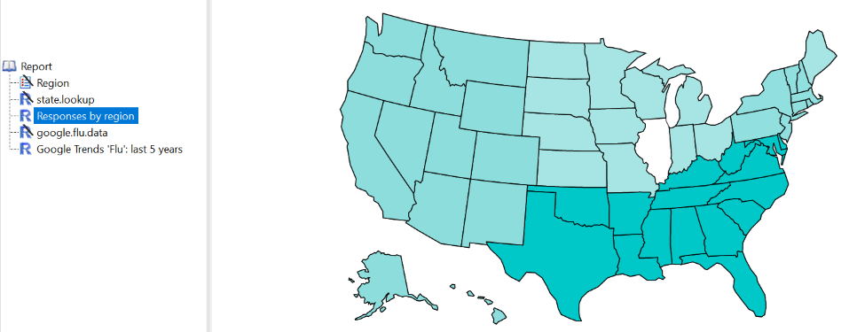
The map above (in the Displayr report) is an HTMLwidget created using the plotly R package. It draws data from a table called Region, which would also be shown in the report. (The same R code in the Displayr example can be used in an R object within Q). So when exported into PowerPoint, it creates a page, using the PowerPoint template, where the title is Responses by region and the map appears in the middle of the page.
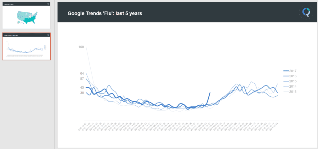
The screenshot below is showing another R chart created in PowerPoint. The data has been extracted from Google Trends using the gtrendsR R package. However, the chart itself is a standard Excel chart, attached to a spreadsheet containing the data. These slides can then be customized using all the normal PowerPoint tools and can be automatically updated when the data is revised.
Choosing the Right Option
So, it's now time for you to decide how you are going to create and update your PowerPoint reports using R. Let's take a quick refresher of the options on the table.
ReporteRs
This free R package is ideal if you prefer a programmatic approach and are comfortable writing R code. ReporteRs provides a high degree of flexibility, allowing you to automate report generation and apply custom logic (e.g., only including significant results). However, the slides generated may require additional styling to achieve a polished look, and setup can be somewhat complex due to dependencies like rJava.
Displayr
If you want something that is both easy to use and inherently powerful, Displayr's PowerPoint automation tool might be the right option for you. It excels at creating PowerPoint reports that are visually striking, while offering the ability to customize with R code if desired. Additionally, Displayr's online accessibility enables interactive exploration and selective exporting of data.
Q
Q is custom built for survey reporting, perfectly striking a balance between automation and flexibility. It allows for seamless integration of R-generated analyses with native PowerPoint elements like tables and charts. This is especially useful if you need editable outputs that can be customized further within PowerPoint.
Key Considerations
- Technical Expertise: If you’re confident when it comes to writing code with R, ReporteRs provides a more familiar and customizable workflow. For less technical users that need support, Displayr and Q offer more accessible alternatives.
- Time: The amount of time you have available to creat your report will also dictate your decision. If you are not particularly limited by time, ReporteRs is great. However, if you are on a tight deadline, Displayr and Q's no-code capabilities can help speed up the process.
- Visual Design: Choose Displayr for visually engaging presentations with minimal coding.
- Dynamic Updates
Explore the Displayr example
You can access the Displayr document used to create and update the PowerPoint report with R here (just sign in to Displayr first). Here, you can poke around and see how it all works or create your own document.
Technical notes
Since this post was originally published, one of the packages used by the example code from the section Option 1: ReporteRs above has changed, preventing the code from running as described. In order to run the code above, you will need to install the previous version of the package gdtools (which is a dependency of the main package ReporteRs). You can do this with the following code:
packageurl = "https://cran.r-project.org/src/contrib/Archive/gdtools/gdtools_0.1.5.tar.gz"
install.packages(packageurl, repos=NULL, type="source")
We will get in touch with the package authors and update this post again when the issue is resolved.
Additionally, there are a couple of things to keep in mind when running this example:
- ReporteRs makes use of rJava, and you should make sure that you have the latest version of Java installed on your system.
- You should create the folder c:\delete\ on your PC, or modify the path used in the example code.
