
Put PowerPoint into Cruise Control: How to Automatically Update Your Reports
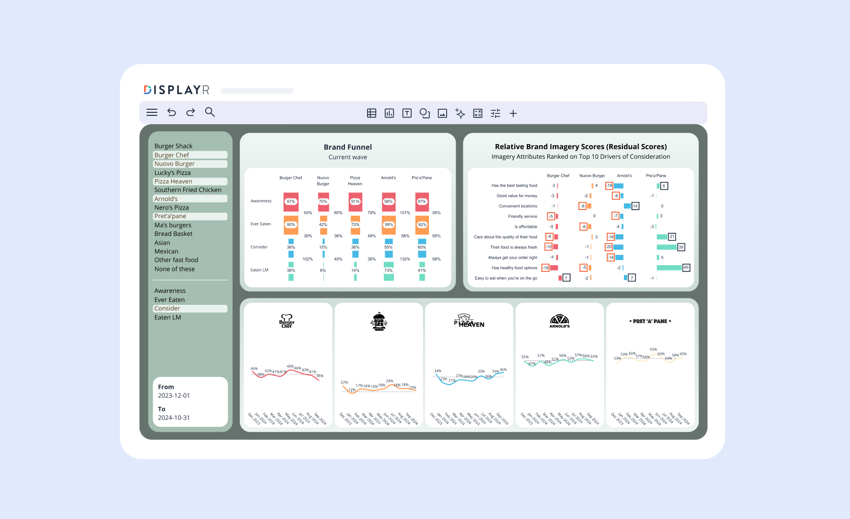
The ability to automatically update PowerPoint slides with new data can save time, money, errors, and your sanity. With tools like Displayr, you can let your reporting run on autopilot while you focus on the big picture.
- How to reuse and automatically update PowerPoint slides efficiently.
- Automating PowerPoint updates from Excel for dynamic reports.
- Tools and techniques to link PowerPoint and Excel for seamless data integration.
Automatically updating PowerPoint slides (the deck) isn't just in the realm of tracking studies. It is equally applicable to ad-hoc work. You can essentially write a report from a mid-field data export, and then automatically update your report with the final data. This can speed up your reporting turnaround enormously.
Considerations for evaluating software in the context of PowerPoint updating
As we evaluate PowerPoint's ability to update, and how analysis software packages can automate this, it's important to bear a few things in mind:
- Automatic updating doesn’t mean 100% automation. If you can update 75% of your tables and charts in PowerPoint at the push of a button, then that is a gain in both efficiency and accuracy.
- External software is limited by the extent to which PowerPoint will listen. Microsoft isn’t going to redesign PowerPoint to suit an analysis program (including a large player like SPSS). External packages can only "talk to" PowerPoint and "ask it" to do certain things. If you expect everything to be updated, then see the first consideration above.
- Is automatic updating a one-step or multi-step process? If your software needs to export the data into an intermediary file, like Excel, then it's a multi-step process. Ideally, you want it to go directly into PowerPoint (one-step). Why? A one-step process is faster and more robust. Things have more chance to muck-up if you're updating via a third program.
- Can you specify or preserve the design of the table or chart in the update process? If updating the data means that your carefully crafted design is reset, then that's a real bummer. It may make the updating process redundant in terms of efficiency gain. Below, we discuss how table-updating is prone to bulldozing your beautiful design, whereas chart updating is not.
- Can you alter the information that you've updated afterwards in PowerPoint? Because if your output comes into PowerPoint as a static image, you can't tweak it in PowerPoint. You'll need to go back to your original program to make modifications. If the data comes in as free text or spreadsheet data, you have more flexibility. You can make modifications without recourse to the external program.
The elements of PowerPoint that can be updated
From a technical perspective, a PowerPoint slide is not just a uniform whole, but rather a composition of different elements. External software needs to generate an element first in PowerPoint, before it can update it later. Why? When external software generates an element (text field, chart, table) it installs a hidden ID tag. The software then uses these ID tags, known as GUID, as a reference when it's time to update.
Each of these elements vary in their ability to be automatically updated. Here we look at the three elements of PowerPoint that allow automatic updating.
The hidden spreadsheet behind charts
When you click on a chart within PowerPoint, you have the option to Edit Data. There is a hidden spreadsheet that sits behind the chart. PowerPoint gathers the data from this unseen spreadsheet and uses it to generate the chart on the slide.
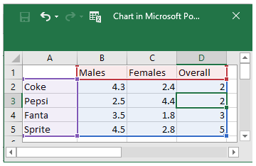
Ensure that your analysis software inserts data into this hidden spreadsheet. If a program can’t do this, the only option to get a chart into PowerPoint is via an inflexible, static image.
Chart template files – the .crtx files
When you right-click on a chart in PowerPoint, you see the option to Save as template. This saves the design of your chart (font, colors, inclusion/exclusion of chart elements) that you can recall later on. You can use this design and apply it to other charts within PowerPoint, using the Change Chart Type button in the design ribbon.
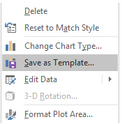

PowerPoint saves the template as an external file. On your PC, these appear as Chart Template, or .crtx, files. Certain (clever) programs can reference this file when they instruct PowerPoint to build a chart.
There is an art to creating good templates. Check out Q's wiki for some general tips that apply regardless of whether you are using Q or not.
The Slide Master and the components it offers
The slide master in PowerPoint (found under the View menu in the ribbons tab), has a number of design features and elements that you can set. This includes specially identified text areas (fields) such as the Title and Footer that external software can reference as it speaks to PowerPoint. You also can set up color palette and font defaults, which PowerPoint will reference when it generates new slides with exported tables or charts.

PowerPoint charts are easier to automatically update than tables
Tables and charts within PowerPoint operate very differently, and this influences their respective ability to be automatically updated.
Unlike charts, tables do not have a hidden spreadsheet underneath the table. The information in a table is essentially text (even if they represent numbers). With tables, what you see is what you get. Therefore when setting up a table to export from external analysis software will need to have the table's data (including the numbers and column labels) set up exactly as you want it before it comes into PowerPoint.
On the other hand, with charts you can hide certain elements (such as rows and columns). You can also change how the visual chart references the hidden data at will.
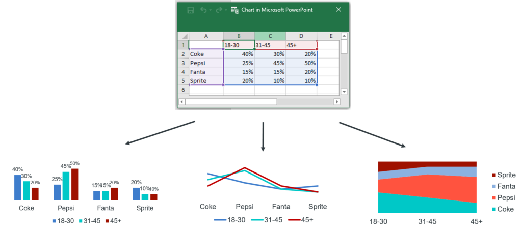
This lack of a hidden data spreadsheet with tables, has implications on the design of tables as well. Because external software will paste information into the table (as text, including the labels), any modifications that you had manually made to the format of the text/numbers previously may get overridden in the updating process. This is because, unlike with charts, PowerPoint does not have a mechanism to lay formatting over the top of a table. This is because charts have the separate design file (the .crtx file as described above), whereas tables do not. You can change a chart's data without influencing its design at all (and vice versa). Unfortunately, the same can't be said of tables. Consequently, you need to be mindful of how the updating procedure will impact the look of your tables.
In a nutshell, the automation potential is far greater for charts than tables in PowerPoint. With charts you have more control and flexibility.
Automating image updates in PowerPoint
When we think about automatically updating reports in PowerPoint, most of the focus is (rightly) on the data in said report. But reports should tell a story in an engaging and visually appealing way - this means fresh images. To automate image updates:
- Use tools that support linked image features, allowing images to update dynamically when the source file changes.
- Ensure your analysis software integrates seamlessly with PowerPoint to replace static images with dynamic visualizations.
Reusing and automatically updating PowerPoint slides
The ability to reuse and automatically update reports has the ability to save you countless hours. Some simple guidelines to follow to start gaining these efficiencies today include:
- Save and reuse templates: Create a PowerPoint template with placeholders for charts, tables, and images.
- Leverage external tools: Use tools like Displayr to update existing slides with fresh data without losing your design.
- Dynamic slide linking: Set up links between your PowerPoint reports and external data sources like Excel for automatic updates.
Which analysis software programs automate PowerPoint updating?
Here we consider four packages: SPSS, R, Q, and Displayr.
R can’t really do much with respect to PowerPoint updating. You may be able to export data into an independent Excel spreadsheet, and then set up links between the external Excel and PowerPoint to update charts.
SPSS Statistics can export charts and tables into PowerPoint as static images. Their Data Collection product can generate tables and charts within PowerPoint.
Q directly exports crosstabs as either editable tables or editable charts to PowerPoint, and these can be automatically updated. Q also has proprietary charts and visualizations which do not correspond to PowerPoint charts (such as word clouds and ranking plots). Like SPSS these export to PowerPoint as static images, but can be updated from Q. Q can directly access the slide master elements (title, footer and color palette) for updating purposes as well (e.g. automatically updating the footer information with base size, statistical information, etc.).
Displayr's PowerPoint Automation tool allows you to automate data-rich reports. You can construct, design and arrange all your bits and pieces (tables, charts, visualizations, advanced analysis models) directly on the Displayr page. Visually, a Displayr page corresponds to a PowerPoint slide. When you publish the Displayr report to an offline PowerPoint file, the slides contain all the bits just as you had arranged them online.
Charts and visualizations can be exported as images or as editable PowerPoint charts. It is also possible to update an Existing PowerPoint document with the revised data, whilst keeping all the work done in PowerPoint intact. Displayr will update charts, tables as well as text boxes. It takes only a few clicks to update your PowerPoint report. Total cruise control.
