Everything You Need To Know About Net Promoter Score (NPS)

What is NPS?
The Net Promoter Score, frequently shortened to NPS, is a benchmark of customer satisfaction that assesses how likely your customers are to recommend you to others. The NPS is a relatively simple surveying technique designed to find your most loyal customers who will attract and refer new business and help identify where you can improve customer loyalty.
It is widely used across a variety of sectors and use cases, including technology and SaaS, retail, healthcare, insurance, e-commerce, logistics, and consulting, making it a standard metric for measuring customer experience and benchmarking performance within and across industries (more on benchmarking later).
How Does the NPS Work?
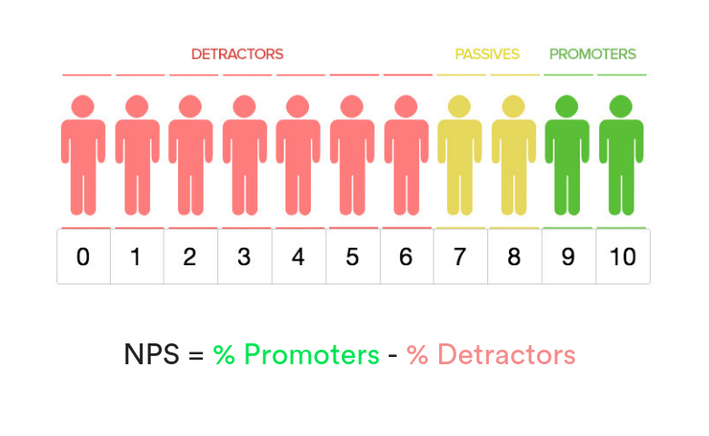
So, how does it work? Simply ask your customers a single question: “How likely is it that you would recommend my brand/product/service to a friend or colleague on a scale of 0-10?”. Respondents are then sorted into groups based on their answers. Those who fall into the 0-6 score group are known as detractors, while those who fall into the 9-10 score group are known as promoters. What if they gave a score of 7 or 8? This group of customers is known as passives – while 7 or 8 is not a bad score, it is not positive enough to suggest that they will be likely to actively promote your brand by recommending it to a friend.

Why Should I Measure My Company's NPS?
Put simply, the NPS is one of the easiest and most effective measures of customer loyalty. Involving only a single question and a follow-up, it is a relatively low-burden survey for customers to answer. It also makes the NPS one of the least complicated surveys to administer AND analyze. Only a single simple formula is needed, meaning that you don’t need to hire a specialist to administer the NPS survey or to calculate the results.
The Net Promoter Score can help you quantify something that can be tricky to measure – word-of-mouth. Net Promoter Scores also correlate with a company’s organic growth measures. Finally, one of the most underrated factors of the NPS is that it can align a team under a common goal – improving your company’s NPS.
How To Calculate NPS
To calculate your NPS, all you need to do is subtract the percentage of detractors from the percentage of promoters. As a simple example, if you had 100 responses with 80 Promoters (Promoters = 80%) and 20 Detractors (Detractors = 20%), this formula becomes:
80-20 = A Net Promoter Score of 60
What is a Good NPS?
As mentioned above, NPS is a metric widely used across a variety of different industries. This means no matter what field you're in, you can easily find a simple benchmark and compare how your product or service stacks up. According to SurveyMonkey's benchmark data from over 150,000 organizations;
- The median NPS is 44
- If you have an NPS score of 72 or higher you're in the top 25%
- The bottom 25% have an NPS of zero or lower
The median NPS varies across different industries, with things like software and online services at the lower end (44) and insurance around the top (65).
Why Do Some People Hate NPS?
NPS splits users into promoters, passives, and detractors. And the concept of NPS in and of itself has plenty of detractors.
The main criticism of NPS is that it can easily be manipulated (either deliberately or inadvertently). For example, those with the strongest opinions (the detractors and promoters) are typically the most likely to respond and share their opinions. This can skew the data, as it means passives are underrepresented when calculating the score.
Another criticism is that dividing respondents into only three categories overlooks potentially useful information. The arbitrary nature of the scoring doesn't allow for nuance. For example, a McDonald's customer might love the fast food restaurant overall, but passionately dislike one particular menu item. Unless you surveyed customers on each individual item, it would be very hard to reflect these sorts of customer preferences using NPS.
Just like anything, NPS has its pros and cons. However, it is important to remember that most of the criticism of NPS comes down to its simplicity. But it is this simplicity that makes NPS so useful to market researchers.
Analyzing and Visualizing Your Net Promoter Score
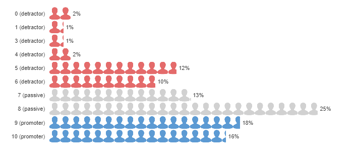
You can analyze and visualize your NPS in several different ways. For example, one of the simplest visualizations is to plot the frequency or percentage of the ratings, which range from 0 to 10 (see below). This plot provides insight into the distribution of ratings within each group. You can also create a visualization based on responses by promoter group if you were doing a comparison between brands, services, or products.
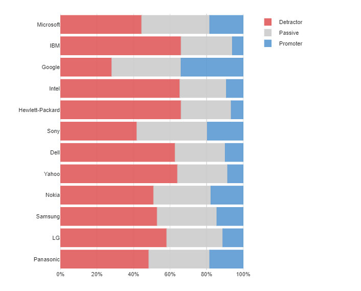
You can also simply aggregate ratings by promoter group when visualizing NPS (see below). This is ideal if there is a large number of passives, as it highlights the potential to improve NPS by nudging them to become promoters.
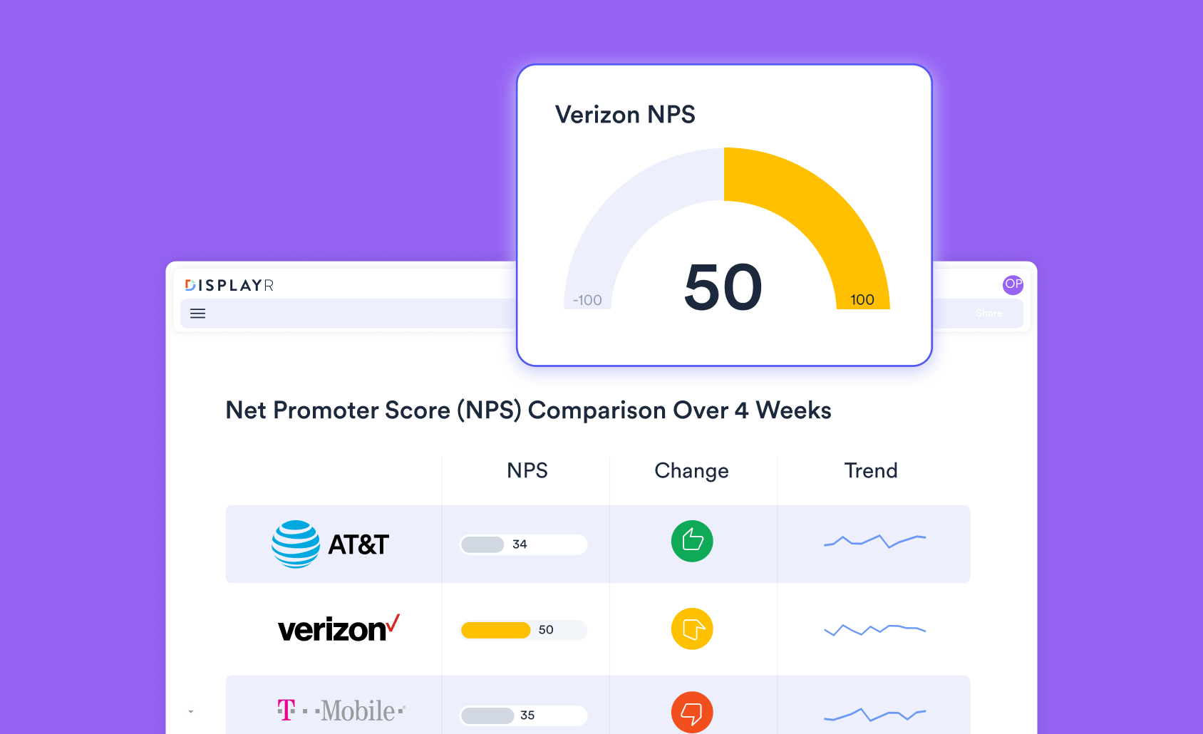
It is also useful to see how NPS changes over time, particularly if you have implemented new strategies aimed at improving the customer experience. This is best done with a column or line chart (see below), where the cases have been aggregated over sufficiently large time periods so that there are enough cases in each period.
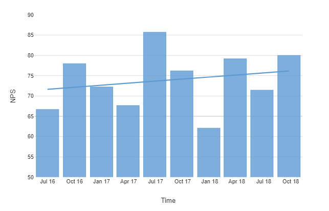 The final aggregation step is to compute NPS as the percentage of promoters minus the percentage of detractors. Rather than just calculating one NPS for all the respondents, you can explore your NPS for categories of respondents, such as by age, gender, income, or other attributes. Is there one group that is more likely to be promoters or detractors? You can also use column or line charts to show your NPS over time. This is particularly useful for investigating whether your NPS is affected seasonally and seeing if you can identify any trends.
Learn more about visualizing NPS with Displayr.
Net Promoter Score Analysis Software
Net Promoter Score (NPS) is a great way to evaluate brands, companies, and even divisions within businesses. However, without the correct analysis, it is nothing more than an arbitrary number.
Good NPS analysis software is able to apply statistical tests to NPS so you'll know if changes in performance over time are real, or just random noise. They'll also provide an easy way to test how your NPS differs amongst demographic groups, such as age or other segments.
Displayr is custom-made for measuring, analyzing, and visualizing your Net Promoter Score. Main features include:
- Advanced Analytics: Want to be able to use statistical modeling and machine learning to uncover the secrets to improving your Net Promoter Score? Displayr has you covered.
- Ease of use: Displayr can be used by everyone from the most advanced of researchers to non-technical people.
- Beauty and functionality: Need to present your NPS findings in an impressive way? You can create beautiful and interactive dashboards. Change filters with one click. Sort your NPS by departments. Include logos, brand images and customize so it looks exactly the way you want it.
- Recoding made simple: Displayr can automatically recode your data to make it easy to use in a wide range of statistical analyses. Say goodbye to time-consuming manual recoding.
- Statistical testing: Want to know if changes in your NPS are actually statistically significant? Displayr is the only NPS analysis software that has built-in stats testing. See below for more info on how Displayr does statistical analyses with NPS.
- Value: Using multiple tools to analyze and present your data? Using add-on dashboarding solutions? By combining all the things you need to do, Displayr will save you from spending. Best of all, you can try Displayr for free!
Learn more about NPS
- What is the Net Promoter Score?
- Customer Satisfaction Score vs Net Promoter Score
- Relational versus Transactional NPS
- 4 Reasons Why You Should Be Measuring Net Promoter Score
- Sample Sizes for NPS
- How to Optimize the Mobile Delivery of your NPS Survey
- How to Analyze Your Net Promoter Score
- Statistical Testing of the Net Promoter Score
- The NPS Recoding Trick: The Smart Way to Compute NPS
- How Good is Your NPS? Using Industry Benchmarks