The standard summary outputs from the glm and lm summary methods are a case in point. If you have been using R for as long as I have (19 or 20 years…) you will no doubt have a certain affection for them, but to a new user they are both ugly and not optimized to aid interpretation.
The sad old default summary output from glm and lm
The default output, shown below, is not terrible. By 1960s standards it is pretty good. If you know where to look and are good with numbers it is serviceable. But it can be bettered.
1. An HTML table
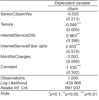
The most basic level of improvement is to make an attractive table, as done by the stargazer package. It improves on the 1960s style standard output by creating an HTML table, but in the style of an academic publication (R code: stargazer::stargazer(my.glm, type = “html”); be careful if copying this as you’ll need to replace the quotation marks with R-friendly ones).
2. A 21st century table
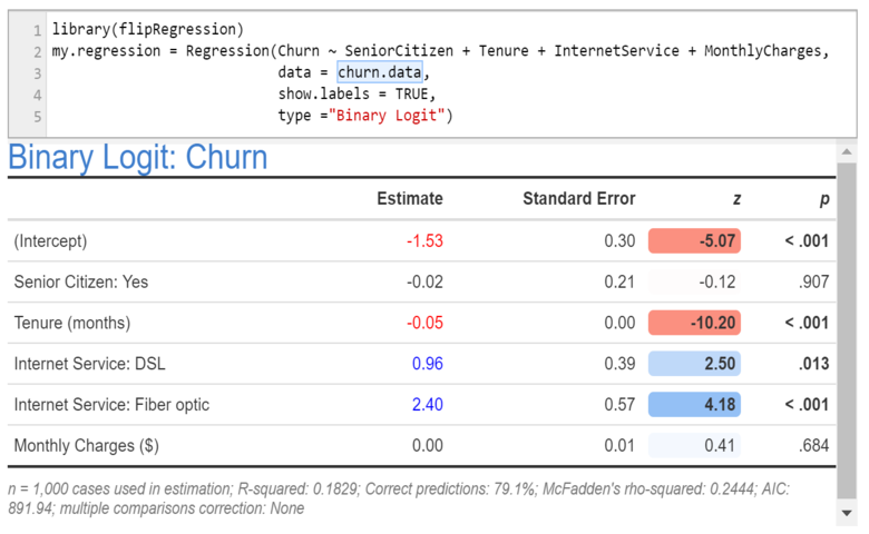
The output below uses more modern R technology (HTML widgets). It improves on the previous outputs in two ways:
- The formattable package is used to create an attractive table which redundantly encodes information by color, bolding, cell shading, and relatively extreme rounding.
- The table uses variable labels, rather than names. These labels are stored as attributes of the variables in the data frame (e.g., attr(x$MonthlyCharges, “label”) = “Monthly Charges ($)”; again, be careful if copying this to replace the quotation marks ). stargazer also supports such labeling, although they are passed into the function as arguments rather than attributes of variables.
This output has been created using the Regression function in our flipRegression package. This is running glm in the background. This is preloaded and available from the menus when you use Displayr, but you can also install the package from github.
3. Importance scores instead of coefficients
A more extreme approach is to report importance scores instead of coefficients. For example, the table below uses a modification of Johnson’s relative weights as a way of simultaneously addressing the correlation between the predictors and the dependency of coefficients on the scale of the predictors (Johnson, J.W. (2000). A heuristic method for estimating the relative weight of predictor variables in multiple regression. Multivariate behavioral research 35, 1-19.).
The modification is that I’ve assigned the signs based on the signs from a standard glm. This has been produced using the same Regression function described in the previous section, but with an additional argument of output = “Relative Importance Analysis”.
4. Effects plots
Alternatively, we can go entirely graphical in our presentation of the model. I’ve created the plots below using the effects package. A few points to note:
- Of the outputs examined in this post, these are the only ones that both show the effects and the distribution of the predictors. If the goal is to understand the model, these plots are extremely informative.
- By using a common y-axis it is easy to assess importance. (Although note that the mean probabilities that can be read off these plots are biased, as these plots are created under the assumption that the mean function for the model is linear, which is not the case for the logit model).
- The graphical presentation of the confidence bands is much more informative than the standard errors in the previous outputs.
5. Simulator
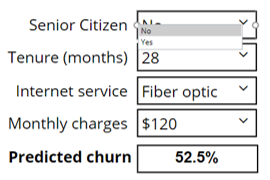
The last way of presenting the results is to show a simulator, allowing the user to experiment to gain an understanding of the interplay of all the predictors in predicting the outcome categories. Click the image below to go to an online simulator or click the button below to explore and edit the code. You can find out more about creating simulators in “Building Online Interactive Simulators for Predictive Models in R.”


